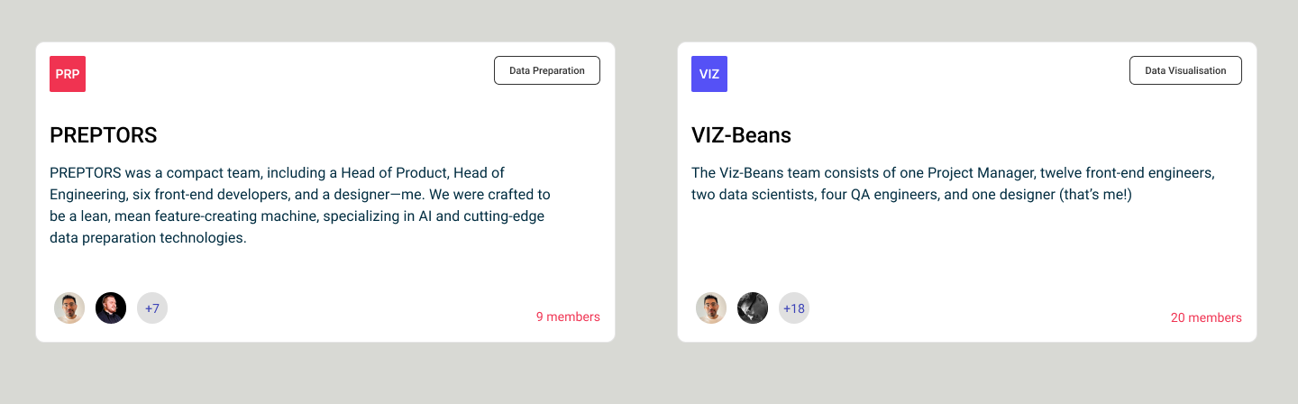
An insights and data-visualization platform for business decisions. I worked across two pods, shipped 40+ features, and owned the design system underneath them.
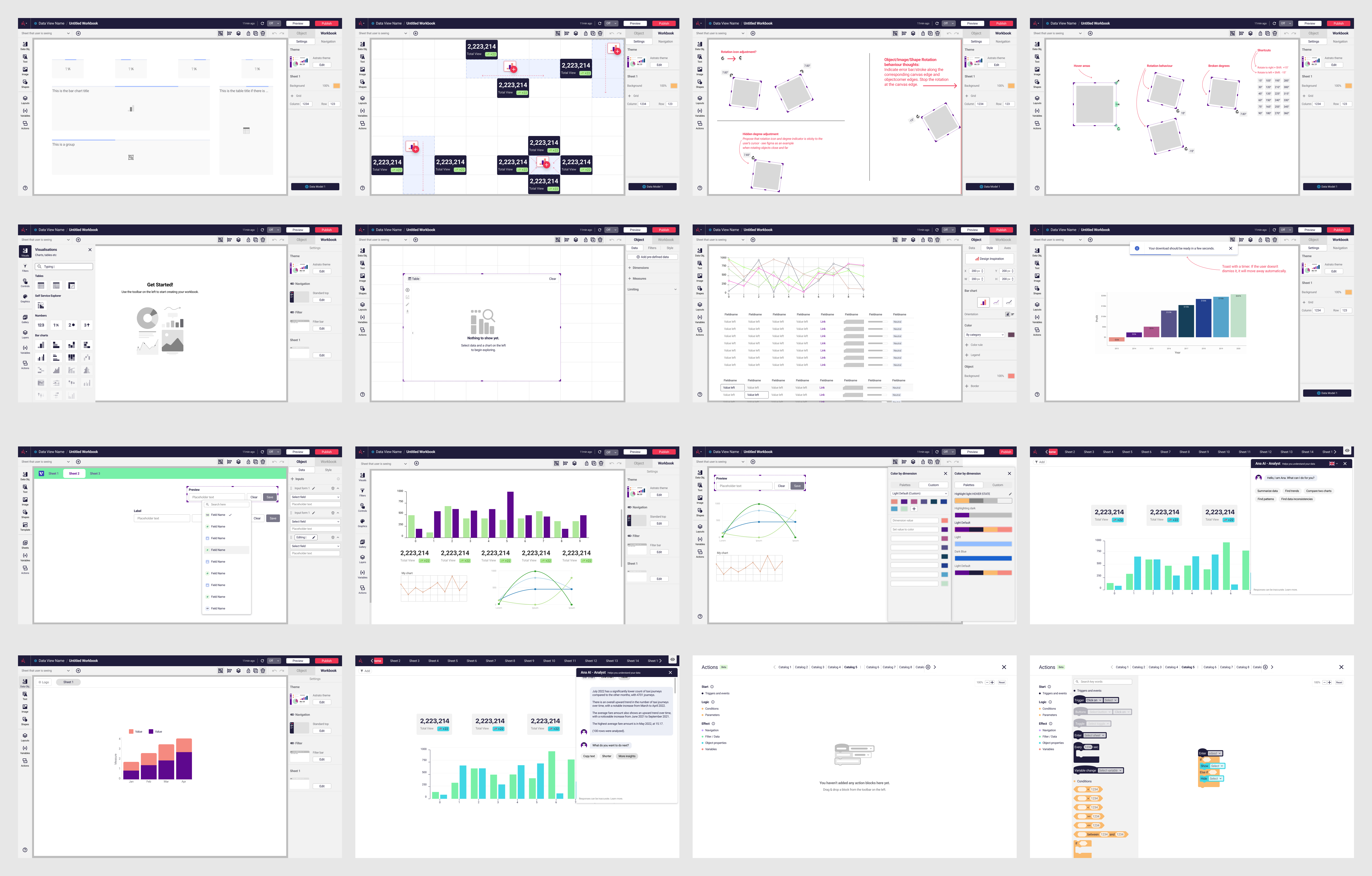
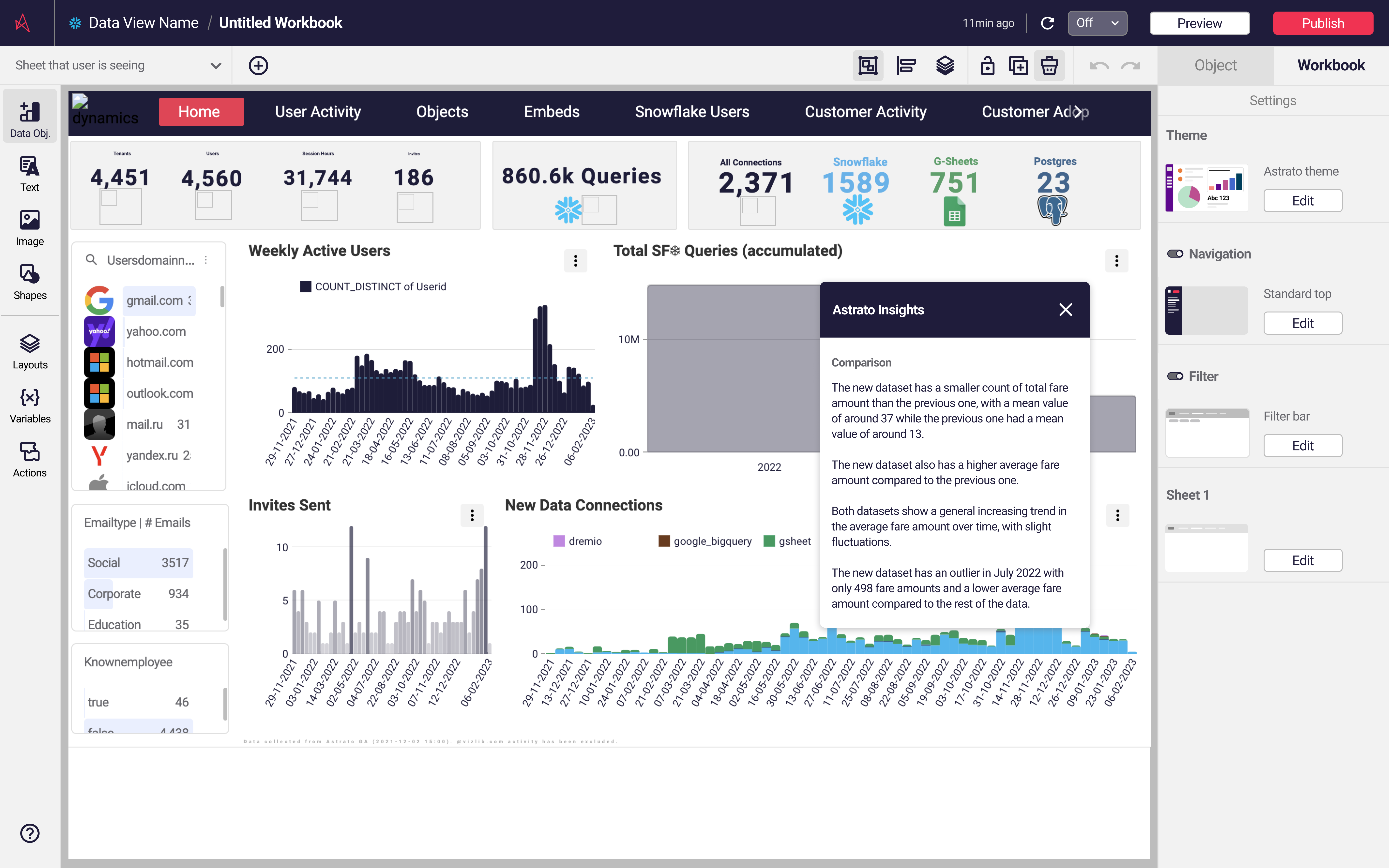
The surfaces where insights become decisions: charts, dashboards, and the AI-powered assistant that turns questions into visualizations.
Where the raw material gets shaped: the Data Explorer, join canvas, and model views that analysts live in before a single chart exists.
Three stories from the 40+: a feature improved, a feature born, and the system that kept everything consistent.
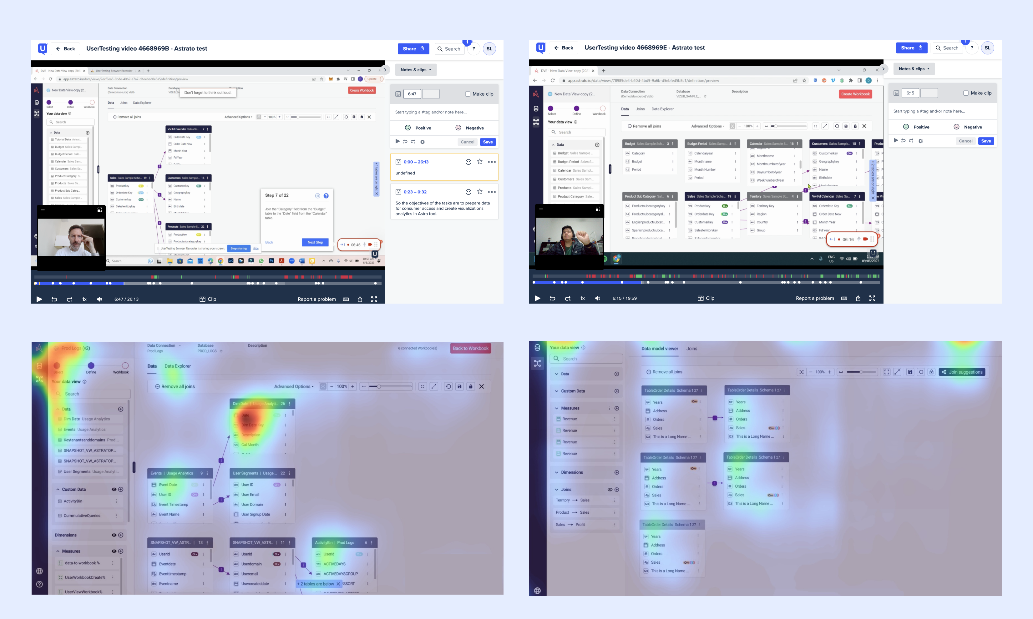
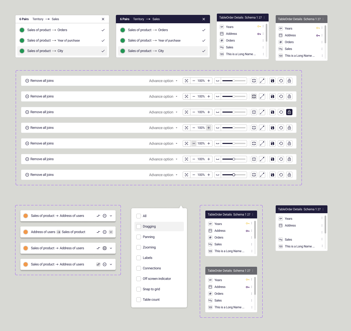
Data comes from everywhere; the join workspace made combining it painful. Overlapping join lines made models unreadable, and connections were locked left-to-right. Reading a model meant untangling it first.
Most issues were rooted in technical limitations. My job was to understand them deeply, then design around them without compromising the experience.
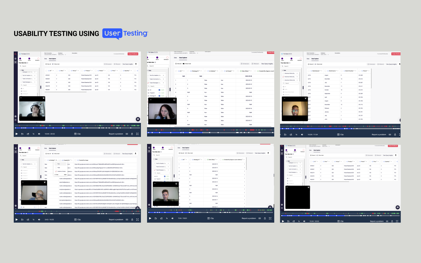
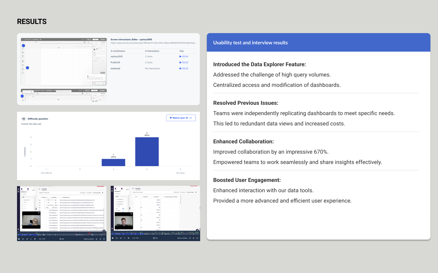
UserTesting recordings and attention heatmaps drove the redesign. The clutter wasn't an opinion; it was measurable.
The redesigned Data Explorer doing its job: tables dropped anywhere, joins connecting from any side, four clicks from raw tables to a readable model. This is the flow the UserTesting sessions said was impossible before.
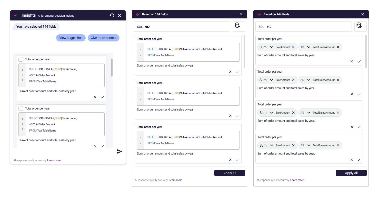
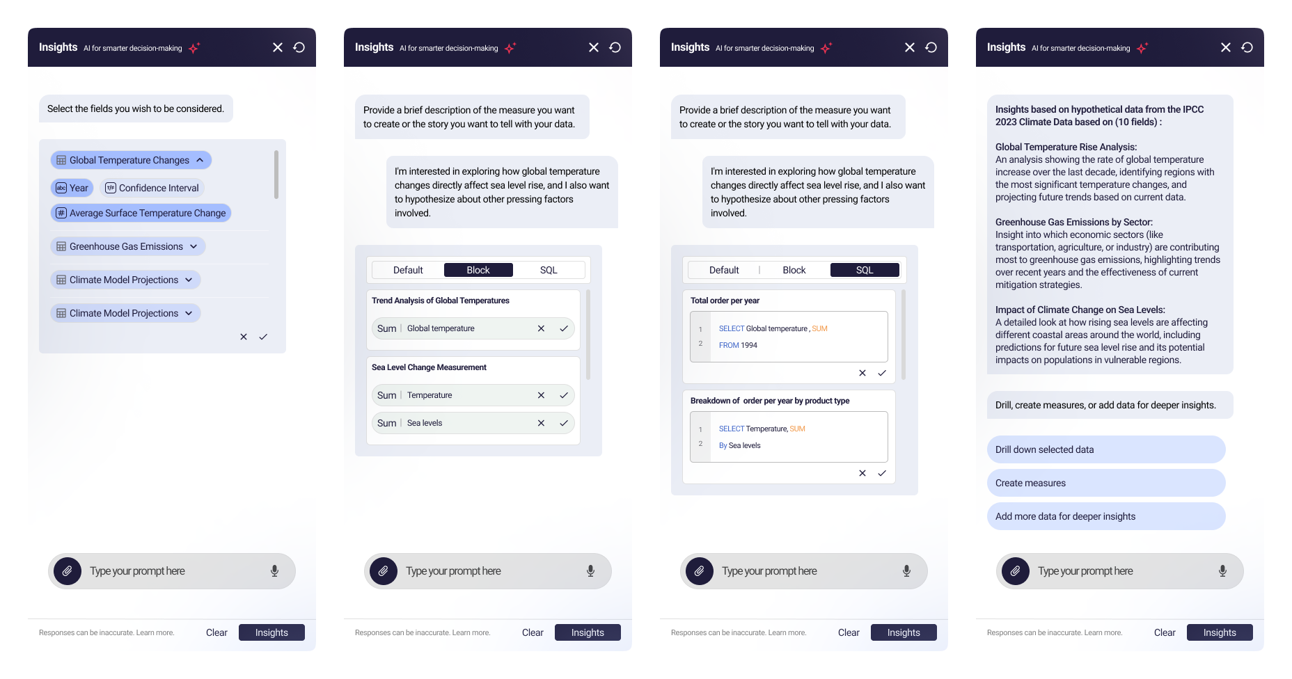
The hardest part of insights is knowing what to ask. Users get handed huge datasets and no starting point. We built an AI assistant that bridges raw data and an actionable answer.
Type a question; get a visualization as measures and dimensions. Then it meets each user at their level:
Full ownership of the component libraries for my products. New components only when necessary: restraint is what keeps a system a system.
Shipped exactly as designed: the payoff of talking to engineers every day from day one, not at handoff.
Because the back-and-forth never stopped, development was seamless. The shipped product was a direct reflection of the design.
THE COLLABORATION DIVIDEND